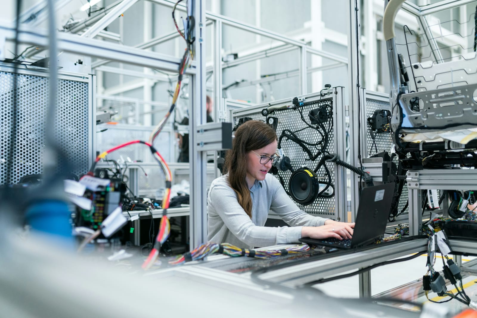
We met in sunny Antalya and talked with Matvey Bryksin, co-founder of HMI SYSTEMS and a Human-Computer Interaction specialist who led the factory interface design for a UK-based EV manufacturer Arrival.

HMI: What it is and Where It's Used
HMI stands for Human-Machine Interface, primarily used in industrial settings. On HMI panels, you can monitor equipment metrics, set speed and temperature, adjust production line operations, and compile reports.
The foundations of HCI were laid in 1948 by Wiener in the book "Cybernetics or Control and Communication in the Animal and the Machine“. The concept of human-machine interaction was first raised there. The term “user” was introduced with a specific meaning: “Who can use”? In other words, who has the skill? Because not everyone can use machines. They had a different term for those users — operators.
Now, HMI can be as simple as a tablet or as complex as an industrial panel with visual indicators, lights, and sound alerts. It has evolved into a software-hardware complex, not just an interface. Industrial automation, like at McDonald's, is a common area of use. They were pioneers in implementing operator-based HMI, where the panel displays what needs to be prepared and served.

Characteristics and Examples of Working in Manufacturing
We asked Matvey to provide several examples of how he made design decisions in different cases.
In my courses, I often mention, "Now we'll cover hardware in our lectures, followed by topics like software user experience and customer experience."
At first, it may seem like these topics can be neatly separated. However, when you take the developed application and put it in a physical industrial environment, you may realize some issues. For example, you might notice that the lighting is insufficient, and the buttons are not visible. Perhaps the designer used #F9F9F9, a gray color that is simply not visible in an industrial setting!
I was once taken to a factory where they produced sauces for McDonald's. They strictly adhered to all the standards: maintaining cleanliness, ensuring no hair could contaminate the products, and providing protective outfits to prevent spills. When using software in such an environment, you also encounter limitations.
How do we decide between a touchscreen and a non-touchscreen? It depends on how we input information. If users need to access logs, then a station with a keyboard for typing should be set up. However, if a person only needs to press a single button, they should be able to hit it with their palm.
Some people work in gloves. You can buy touchscreen-compatible gloves, but just imagine going to the factory director and suggesting it. He buys 10-cent disposable gloves that are thrown away. Instead, consider using voice control! It works really well for simple operations like confirming tasks.
I once had a case where we created an AR application using MS HoloLens for brokers. You would put them on, and they would visually display graphics to you, such as the pound's exchange rate. However, everyone grew tired of using them constantly. Imagine wearing glasses just to always see the pound's exchange rate - it felt a bit foolish!
I've seen cool projectors that can project information for you. For instance, a worker may have a task to arrange something in a specific way and a laser from above highlights the spot, indicating "Put it here!". This is already augmented reality.
Does man control the machine, or vice versa?
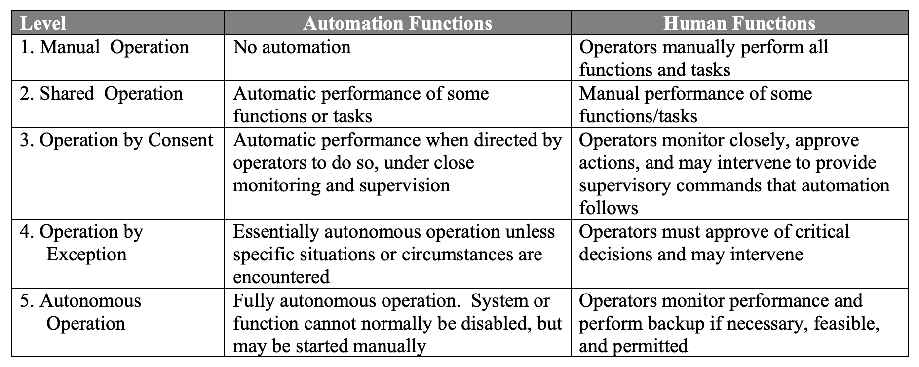
There are two concepts of interaction between humans and computers. The first one is where you exert influence on the machine, and it provides feedback to you. The second, more philosophical concept, is when the machine guides you, and you give it feedback by agreeing or disagreeing. To what extent does your Human-Machine Interface (HMI) control the human, or does it provide tools for humans?
If you work in a factory and need to perform manual operations, what is the best HMI for you? The one that doesn't require active monitoring: it suggests, recommends, and you simply report to it from time to time. In industrial settings with only robotic cells and human intervention only when something goes wrong, such tools are more common.
At a higher level, all use cases can be categorized as follows:
Quality and Automation
Is it necessary to fully automate processes? How does automation impact customer experience? Does it enhance quality or have the opposite effect?
It definitely makes sense to automate complex operations or those with a high risk of defects where precision is crucial. For example, battery operations in electric cars require high quality, and any mistakes can result in significant financial losses. Automating tasks that are heavy, non-ergonomic, or beyond human capabilities is logical. Airports, for instance, have embraced automation extensively. Therefore, it would be inaccurate to claim that automation worsens processes, especially considering that robot errors are typically sub-millimeter.
When producing packaging or mugs, both hardware and software robotics are abundant. For mugs, you need to produce hundreds of thousands of units, and quality is crucial; the mugs should look neat and uniform, not something that can be achieved by hand.
Levels of HMI
We asked Matvey to discuss software as part of HMI and how he would divide it into levels.
We took inspiration from Garrett's pyramid for good UX and divided HMI by several layers.
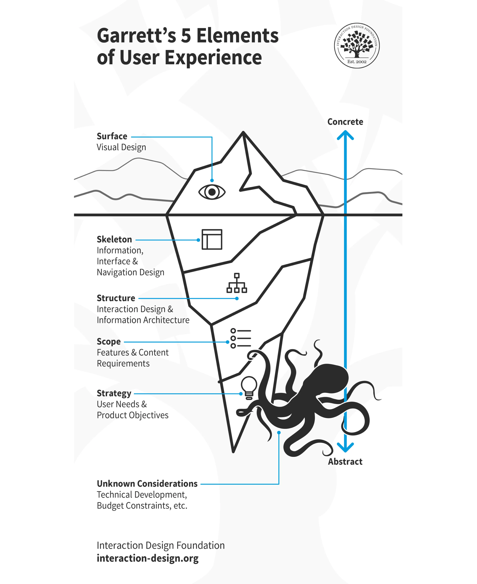
If you don't like a particular visual solution, it doesn't mean everything else is bad. However, with HMI, things work a bit differently.
Levels of HMI design:
1. Product & UX Strategy
Takes data prerequisites as input for the HMI system and transforms critical and supportive factory-level business processes into high-level product requirements and product design. If you have production-specific requirements, you'll need to create a scenario for them.
2. Information Architecture & Interaction Design Principles
Enables basic product strategy principles with the right HMI application structure, navigation patterns and transitions between screens in order to form page layout and positions of UI elements.
What patterns and principles do you use? Essentially, how does the application work and what options are available? Consistency at the interaction level is important.
3. User Interface & Visual Design Guidelines
Defines the visual style and look-and-feel requirements to add specifics to the interface, such as visual representation, affordance and accessibility best practices for graphic elements on the screen.
But within the visual aspect, we embed semantics. In regulatory legislation, there are many predefined colors, particularly industrial ones. These colors are not Pantone paint. For instance, there's a specific yellow color that signifies "Danger." While these may not be formal agreements, it's beneficial for both the real world and software to be visually connected. In real life, red often conveys "Total disaster" — and it should be the same in software.
1. Product & UX Strategy:
Why are you developing the application?
2. Information Architecture & Interaction Design Principles:
How does the application work?
3. User Interface & Visual Design Guidelines:
What does the application look like?
HMI Design: What Sets It Apart
What's the difference between UX in a regular interface and UX in HMI?
At first, we focused on bringing beauty before providing all the functions at once. Looking back, we should have prioritized creating a complete backlog first, and then tackled everything else. Default screens from hardware suppliers gradually take over because they offer more functions. Regardless of their inconvenience or outdated appearance resembling Windows 98, the classic principle remains: design is not just about how something looks, but also about how it functions.
I don't think the tools are ready to create something more modern. How do they manage to create all these standard interfaces? It's like there's an IDE, very similar to... have you heard of Eclipse? It's this old, messy IDE for Java. The tools that robotists produce are very much like Eclipse.
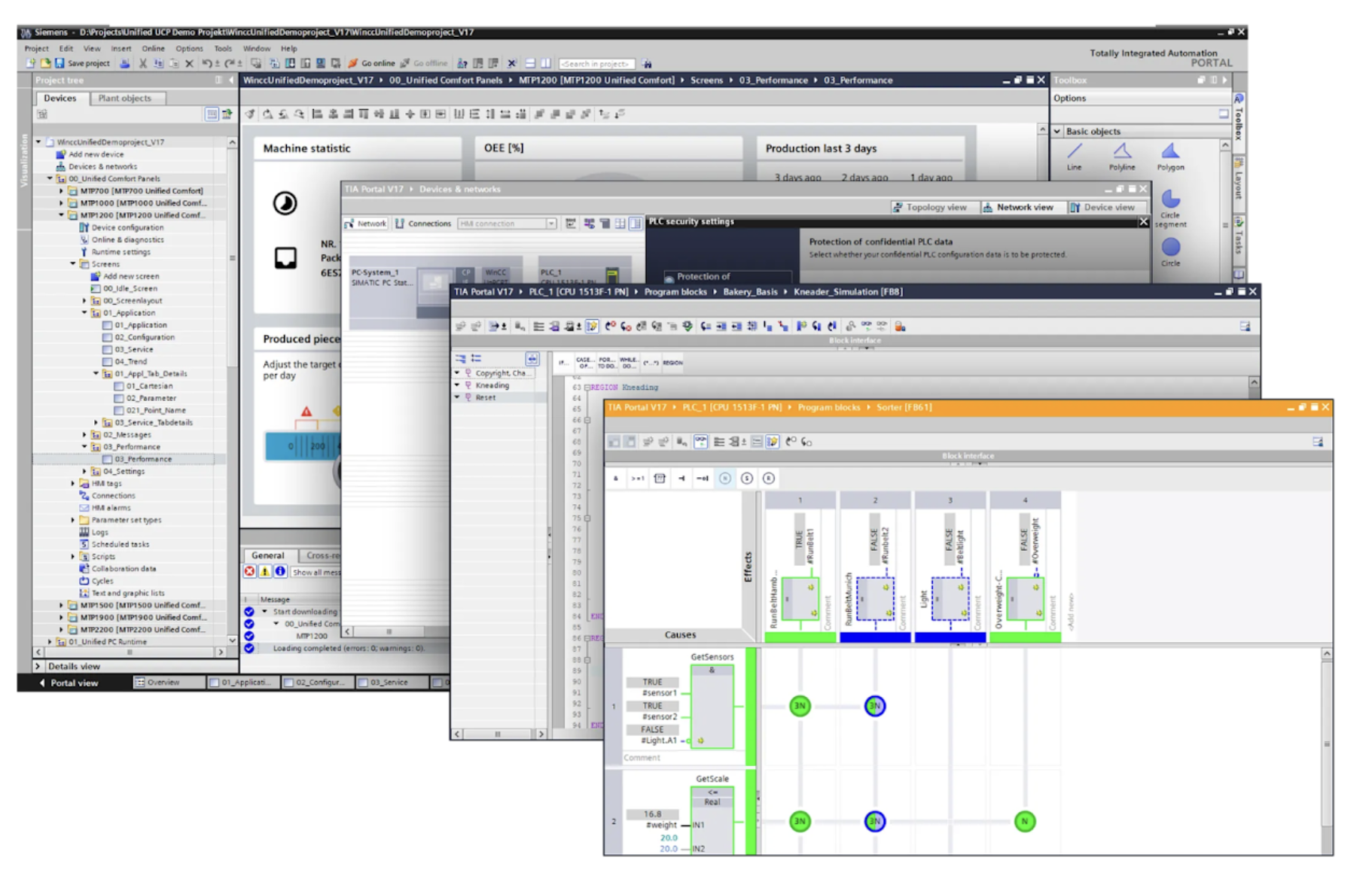
The second point is that roboticists have a completely different education; they are not IT specialists but typically have experience in fields like electrical engineering. Physical interfaces are very unique, and they appear to be recreating them. As a result, many interfaces resemble electrical circuits, which appeals to some individuals. However, for the average user, this can be a significant issue. Poor interfaces can lead to mistakes, such as misclicks or missteps, which can ultimately cost companies money or even lives.
So, the difference between UX in a regular interface and UX in HMI starts with design. There are many factors that set visual design apart, from simple elements like accessibility and affordances to industrial colors. Designers, even those without experience, are often drawn to aesthetics. The goal of HMI visuals is to function effectively in a specific environment, not necessarily to be visually appealing like on Instagram.
In industrial settings, everything may be covered in dust, so colors should be contrasting and spread out across the spectrum, rather than having shades of orange and yellow close together. When you press a button in such environments, it should give you a tactile response to confirm that it worked, unlike on the web where the button may just appear to be clicked. To enhance user experience, sound feedback is often included.
This concept is all about affordances - providing users with simple and accessible interactions despite the complexity of the system. Everything should be easily accessible with just one click.
People in such conditions are often exhausted and tired. The sooner they solve this problem, the better. There's a well-known tale about a maintenance team that was paid for the time they weren't working. The more they worked on a problem, the worse it seemed to get. If you're sitting there with no work, it means no problems — it means you're a good engineer.
How to Understand If HMI Is Good
What are some alternative metrics for HMI? How can you gauge the quality of the user experience?
In addition to accessibility, affordance, and providing simple solutions for tired users, we also pay attention to the Cost of Errors and track Time Spent. This includes monitoring how much time individuals spend using the interface during the workday and what tasks they actually accomplish. We measure the time between specific actions and the number of tasks completed by each person. However, not everything in HMI UX can be directly measured with data.
There won't be any A/B tests here as there won't be enough data available. I have experience with math stats and know the necessary sample sizes - typically around 10, 000 users for a significant sample, which HMI won't have. Therefore, our approach will be more focused on observation. This includes various methods such as interviews, interactive prototypes, and regular demos, rather than conducting surveys like in marketing.
I really appreciate the specificity of the product. It's awesome to stay in tune with users and understand their needs. It's rewarding to have a small user base that is incredibly valuable, and you can't afford to lose any of them. Building relationships goes beyond just user interactions; it's about forming emotional connections with them.
From a sales perspective, it can be challenging. You need to dive so deep that it's almost like putting your head into their factory and looking around.
I don't look down on qualitative research methods; in fact, I value them. I believe that, especially when it comes to new products, about 80% of insights come from qualitative research. Data only helps with fine-tuning. If you're way off base, data won't tell you. If there are underlying issues, data will only give you a hint. That's when you need qualitative interviews and observation methods.
Accessibility
Affordance
Time spent
Tools for evaluation include:
Qualitative interviews
Prototypes
Observation
Design for people, not people for design
We couldn't help but ask Matvey about the people he worked with, the relationships they built, the problems they had, and something about their plans for the future.
They are straightforward guys, hardworking individuals. This definitely impacts the user experience. For example, consider how your grandma might find it challenging to use an iPhone. Many of these users have basic computer skills; some can fill out forms easily, while others struggle with typing. The interface for these individuals should be kept minimal to avoid any issues they may encounter.
We assessed their skills upon entry to determine their level of experience. At one time, I managed all the software on the factory floor, ensuring we knew each person's assigned stand and skill level. We customized interfaces for each stand, taking into account various factors such as different login methods. For instance, terminals with touchscreens didn't require keyboards for password entry, so we implemented NFC authorization for seamless access. The only challenge was entering the email, which led us to innovate with QR codes on badges.
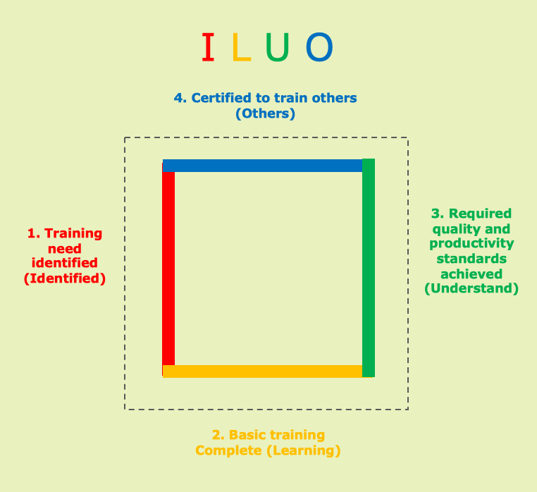
There's a skill matrix called ILUO:
1. Training need identified (identified)
2. Basic training complete (learning)
3. Required quality and productivity standards achieved (understand)
- Certified to train others (others)
Some workers may have common complaints about the system's intrusiveness. One might say, "I'm tired of your smart tips, and your system isn't as clever as it seems!"
Secondly, they might express a need for additional features. They could say, "I want to do things my way, but you don't let me." Sometimes, they complain about the lack of optimization, having to click too much, or finding it inconvenient to enter emails without a keyboard.
I don't want to design HMIs anymore. Automation engineers on the shop floor should handle this, using a library of UI controls to build HMIs like LEGO bricks. The person using the product should be involved because they see everything firsthand, eliminating the need for explanations. They may not be interface designers, but with the right principles in place, they can assemble something sensible. This approach is better than the confusion of trying to explain desires through a game of broken telephone.
If I were to advise someone working on HMI, I would say: consider scalability. HMI is a vast field, and more focus should be placed on fundamental aspects.

